35 Famous American Paintings You Should Definitely See
Explore America's rich history in art with these must-see paintings.
Explore America's rich history in art with these must-see paintings.
The American art scene has gifted us with a treasure trove of renowned paintings that have captivated audiences worldwide. In this article, we invite you to embark on a visual odyssey as we explore 35 extraordinary American paintings that have left a mark on the art world. From the early pioneers of the 18th century to the contemporary visionaries of the 21st century, these masterpieces exemplify the diverse range of styles, themes, and techniques that American artists have employed throughout history.
What’s more American than an iconic portrait of George Washington? Gilbert Stuart’s “George Washington (Lansdowne Portrait)” painted in 1796, presents an engaging insight into George Washington in his final year as President.
Gilbert Stuart’s personal story is as intriguing as his work. Stuart, and his Loyalist family, relocated from Rhode Island to Canada during the Revolutionary War. An interesting turn, considering he would paint the man leading the opposition to the crown. From Canada, Stuart journeyed to London, where he painted from 1775 to 1787. He then worked in Dublin where he worked until 1793, the year he moved back to the United States. In 1796, three years after returning to America, the Lansdowne Portrait was born. This grand piece was gifted to William Petty, a former British Prime Minister. This was an interesting maneuver considering Stuart’s loyalist beginnings and Petty’s connection to a government Washington had fought against.
The Lansdowne’s legacy continued with three exact copies (and numerous similar portraits) made by Stuart. The most renowned of these has been featured in the White House’s East Room since 1800, a testament to the painting’s enduring appeal.

History, art, and a touch of drama collide in John Trumbull’s “Declaration of Independence”. Trumbull, who dabbled in diplomacy and architecture alongside his painting work, crafted it from personal wartime experiences.
This mammoth 12-by-18-foot creation captures the moment the Declaration’s draft was first presented to Congress. Not to be confused with the actual signing of the document. Of the 56 eventual signers, Trumbull immortalized 42. Some who did not sign, like John Dickinson, also make an appearance in the painting. Ever resourceful, Trumbull turned to family when he couldn’t find reference portraits. For example, Benjamin Harrison VI stood in for his father, as did Rufus Hopkins for his dad, Stephen Hopkins.
Trumbull’s iconic work transcends the canvas. It is featured on various bank notes including the 1863 $100 bill, and numerous stamps.

“The Oxbow” or under its formal title, “View from Mount Holyoke, Northampton, Massachusetts, after a Thunderstorm”, is a classic from Thomas Cole. Cole is remembered as the founder of the Hudson River School. In “The Oxbow”, he marvelously captures the Connecticut River Valley aftermath of a thunderstorm. This isn’t just a scenic depiction though, it’s a statement. It portrays the clashes of wilderness and civilization — two key elements of America. That’s the romantic and unique aspect of his craft. He beautifully merged beautiful, grand, and sublime aesthetics into one masterpiece. In “The Oxbow”, Cole hints at the potential of American land. Its dual nature, the untamed and the pastoral, shows a nation’s future ready to bloom.
Cole left a very personal mark on the painting, adding a tiny self-portrait within the wild scenery at the center bottom of the piece. His intent was to proclaim, “I am American, creating American art from American landscapes”.
Today, the painting is held at The Metropolitan Museum of Art in New York City. It has influenced many artists and continues to draw admiration for its unique insights into America’s identity. Cole’s “The Oxbow” is a visual legacy of the nation’s growth wrapped in a panoramic spectacle.

Frederic Edwin Church was a master American painter, famous for his grand landscapes. Like others in the Hudson River School, Church relished in the details and drama of nature. His canvas was a stage for mountains, waterfalls, and blazing sunsets. “Heart of the Andes” is one of Church’s most loved works. The painting was born from his journey to Ecuador in 1857. Church sketched tirelessly during this trip, pouring those visions into this artwork.
Making its debut in New York in 1859, this painting was a hit both locally and abroad, with thousands paying to see it. Nowadays, this national treasure calls The Metropolitan Museum of Art home.
“Heart of the Andes” skillfully blends together the varied South American landscapes Church experienced. A bowl-shaped pool glistens in the foreground, fed by a waterfall to one side. The viewer’s eye is drawn to the distant, snow-capped Mount Chimborazo, while closer hills form a path of descent.
The presence of humans is subtle but significant. The worn path, a hamlet, and a Spanish-catholic church tell stories of life here. In the foreground, locals pause at a cross. What steals the show is Church’s signature carved into a tree at the left. The play of light around the signature has been seen as Church’s comment on man’s ability to tame nature. Another interpretation suggests a more cautionary tale, with the tree’s apparent ill-health conveying nature’s resilience in the face of human encroachment.

“Among the Sierra Nevada, California” is a captivating artwork that Bierstadt painted in 1868. It’s a splendid representation of the scenic Sierra Nevada mountain range, likely inspired by Bierstadt’s association with the 1859 Lander survey expedition. Spearheaded by Frederick W. Lander, this expedition was significant in pioneering a railroad route through the Rockies.
Bierstadt used his artistic talents to capture and promote the beauty of California. His brush strokes detailed the unprecedented natural beauty of the region. One could argue that his artwork served as a picture-perfect marketing campaign for California!
This magnificent piece was created at Bierstadt’s studio in Rome. His Italian influence is seemingly poured into the exquisite details of the California landscape. The painting toured Europe, sparking interest in the idea of immigration to the US.
Today, this work of art is the showpiece of the 19th-century landscape collection at the prestigious Smithsonian American Art Museum in Washington, D.C. It stands as a testament to Bierstadt’s artistic genius and his contribution to bringing California’s unparalleled charm to the world.

“Whistler’s Mother”, also known as “Arrangement in Grey and Black No. 1”, is an American masterpiece with French roots. Painted by James Abbott McNeill Whistler, the image has held iconic status since its creation in 1871. Even though Whistler was American, he was heavily influenced by French and British art.
The portrait is a simple composition, yet it’s filled with psychological depth. Its linear simplicity and strict use of neutral tones can be linked to Whistler’s fondness for printmaking. A hanging print of the Thames in the painting provides a subtle link to his experiments with this medium.
Bought by France in 1891, it’s one of the most famous American artworks outside the U.S. The painting is often compared to the Mona Lisa due to its iconic status. It’s been used repeatedly to symbolize family values and motherhood. To showcase its importance, in 1934 the U.S. Post Office issued a stamp featuring “Whistler’s Mother”. It bears the slogan “In memory and in honor of the mothers of America”. This dedication to motherly affection was also exemplified in Pennsylvania, where an eight-foot statue copying the painting was erected in 1938 during the Great Depression. Whistler’s Mother has stood as a tribute to loving parents and the power of understated artistry for over 150 years.

“Snap the Whip” painted by Winslow Homer in 1872, is a joyous depiction of childhood wrapped in American nostalgia. Renowned as one of the most prominent American painters of the 19th century, Homer portrayed the raw energy and unity of boys playing a high spirited game. Their barefoot antics are a defiant celebration of nature and youth.
These kids represent a hopeful glimpse of America’s future, barefoot but resilient, thriving amidst the chaos. But look a bit closer, the boy at the end being tossed out is Homer’s subtle hint at future hardships. This dash of sobering reality adds depth to a seemingly light-hearted scene. The backdrop, a quaint, red rural schoolhouse, symbolizes an era that was slowly fading into the past. It’s a poignant reminder of a rural life that was being left behind for booming urbanization.
“Snap the Whip” captures more than just a moment of childhood play. It is a reflection of cultural shifts and a snapshot of American history encapsulated in pigments and canvas. It’s no surprise that Homer’s work remains influential as it seamlessly intertwines art, history, and evokes a range of emotions. Winslow Homer’s artistry immortalizes the pulse of his era, and “Snap the Whip” is no exception. This painting is a timeless piece, holding a mirror up to the changing face of a nation while cherishing the vibrancy of youth.

Thomas Eakins’ 1875 painting “The Gross Clinic” is a thought-provoking piece, boasting a place among America’s finest artworks. Eakins envisioned this work to feature at Philadelphia’s 1876 Centennial Exhibition, showcasing his artistic prowess while celebrating the city’s scientific accomplishments.
The main character is Dr. Samuel Gross, a well-respected local surgeon, operating in Jefferson Medical College’s surgical theater. The visual narrative displays Dr. Gross leading an operation on a patient’s thigh while a group of four doctors assists him. Contrasting character emotions are vividly portrayed; Dr. Gross oozes confidence from his experience, while an onlooking lady, alleged to be the patient’s mom, shrinks in clear disgust.
Unfortunately, Eakins’ realistic depiction of bloody surgery led to the painting’s rejection from the fair’s main art exhibition due to its intense subject matter. Instead, it ended up in a model of a military field hospital. Many spectators were shocked and dismayed by the unnerving portrayal of a medical procedure on canvas. However, the piece’s composition, color balance, accurate illustration of form and space, and the unsettling though lifelike portrayal of a surgical operation have eventually gained admiration from art enthusiasts despite its initial rebuff.

Edward Mitchell Bannister was a trailblazer. He emerged as the first African American artist to gain national acclaim when he received the top award at Philadelphia’s 1876 Centennial Exhibition. Surprisingly, his artistic journey began in barbershops of Boston, not art schools or studios, having moved from his Canadian birthplace at the age of twenty to work various jobs.
Bannister’s close relationship with the sea deeply influenced his paintings, of which “Sunset Scene” is a stellar example. An inviting mix of glowing oranges and yellows consumes the center of the painting, hinting at a setting sun over receding trees and buildings.
Unlike his contemporaries painting vast mountains and canyons, Bannister favored scenes that were smaller in scale but equally effective. His ability to encapsulate tranquility and peacefulness in each frame is a notable feature of his paintings. His works, including “Sunset Scene”, are an appreciated testament to his remarkable talent and resilience.

John Singer Sargent, an American artist, was revered for his suave portraits that brought Edwardian-era opulence to life. Born in Florence, he learned his craft in Paris before relocating to London; he lived most of his adult life in Europe. During the 1880s, he submitted a bold painting named “Madame X” to the Paris Salon. This was a portrayal of Madame Pierre Gautreau, a notorious socialite in Paris.
He worked on the piece without a commission, but with Gautreau’s approval. He emphasized her adventurous style, noting the right strap of her dress slipping off her shoulder. A striking contrast appears between her white skin and black dress. The glow of her skin presents a compelling contrast with her coal-black dress. The red hue of her ear, hinting at the vulnerability of exposed flesh, provides a stark contrast against her pallid complexion. All of this was a brazen display of aristocratic excess, causing something short of a scandal.
The painting’s boldness was received more with ridicule than acclaim. Sargent, alienated, had to repaint the shoulder strap. He held onto the painting for three decades before ultimately selling it to The Met. Despite the controversy, Sargent deemed Madame X as his best work, albeit requesting the museum conceal the sitter’s name.

Mary Cassatt’s work often delved into the intimate moments of women’s lives, especially the bond between mothers and children. “The Child’s Bath” is iconic for its unique viewpoint. It’s rendered from an overhead perspective—an unusual choice that drew influence from Japanese woodcut prints and the masterful Edgar Degas. This painting additionally grabbed attention when, in 1910, it was purchased by the Art Institute of Chicago. Today, it is one of the most visited pieces in the museum.
Looking at it more closely, the painting features two distinct areas—there’s a patterned background and a pink and white foreground with the mother and child. The vibrant patterns, like the floral wallpaper and the mother’s striped dress, make an interesting contrast against the child’s plain skin. It’s this contrast that makes the child so eye-catching—a solitaire standing out against the surrounding colors and patterns. One can’t ignore the emotion in Cassatt’s work. The mother’s arm securely around the child represents the safety a mother provides her offspring.
Even though it is a depiction of an everyday occurrence, the painting perfectly encapsulates the beauty and tenderness of these fleeting moments. Amid its beautiful composition and colors hides a representation of love and bond.

In his “In Without Knocking” 1909 work, Charles M. Russell ingeniously encapsulates the vitality of cowboy life. Take notice of the horse breaching through the wooden porch with boundless energy. Russell’s skill in portraying the horses’ natural animosity is truly astounding, exemplifying his artistic talent.
As we shift our gaze to the cowboys, their differing attires carry their own unique tales, a testament to the diverse influences that marked the Wild West. Take a peek at the second cowboy from the left. His hat, known as a Montana short-brim peak, discerns him instantly. His pants, widely cuffed, reflect the fashion of the era: a practical, “one size fits all” approach.
But what truly seizes your attention is his saddle. The detail in the tooling is intricate, suggestive of a pair of patient and skilled hands. The cantle appears to be adorned with a rattlesnake skin, a technique rooted in Texas and Mexican tradition to deter the disturbing discomfort of saddle sores. Taking a closer look at Russell’s painting, one appreciates his deep love for authenticity, preserving the spirit and grit of cowboy life in vivid colors and intricate detail.

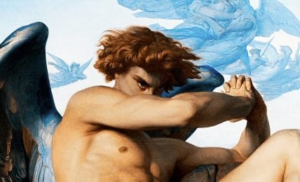
“Portrait of a German Officer” is a powerful blend of love, war, and art, created in 1914 by American painter Marsden Hartley. It was an emotionally charged time as Hartley lived in war-torn Berlin. This vivid painting shows the power, danger, and drama during World War I. Hartley masterfully fused Cubism and German Expressionism, resulting in a unique, collage-like composition.
At the heart of the painting is a tribute to Karl von Freyburg, a Prussian lieutenant whom Hartley loved deeply. His death in the war profoundly affected the artist. Hartley doesn’t show us von Freyburg’s face—instead, he paints symbols of his comrade’s life, and ultimately, his death. Hartley weaved in K.v.F, von Freyburg’s initials, plus the number 4—his regiment. The age 24 reflects von Freyburg’s age at his death. Adding even more depth is the Iron Cross, a posthumous recognition of von Freyburg’s courage.
Hartley’s letters hint towards his romantic feelings for von Freyburg. This passion adds an emotional factor to Hartley’s respect for the German officer. “Portrait of a German Officer” is more than just a painting—it’s a statement of love hidden in symbols, a snapshot of Berlin’s life during the war, and a testament of Hartley’s masterful fusion of various art styles.

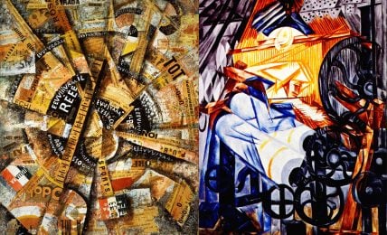
Charles Demuth left his mark in the Precisionist art movement. Precisionism is known for its sharply defined forms, reminiscent of Cubism. Between 1924 and 1929, Demuth produced eight symbolic tributes to influential American artists, writers, and performers.
His painting “I Saw the Figure 5 in Gold” breaks traditional portrait conventions. It is a tribute to his friend, the poet and physician William Carlos Williams. Demuth pulls imagery from Williams’s poem, “The Great Figure”, creating an evocative painting of a fire engine rushing down the street.
A careful examination of the painting reveals intersecting lines and repeated instances of the number “5”. Combined with the round forms of street lamps, lights, and sirens, these elements infuse the painting with an electrifying urban energy. This painting is a dynamic depiction of an urban scene, a poetic response, and a tribute to friendship.

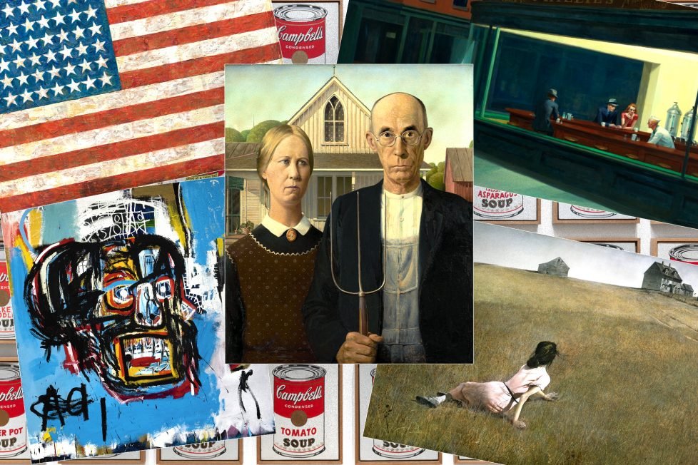
“American Gothic” the renowned 1930 painting by Grant Wood, garnered fame when it won a $300 prize at the prestigious Art Institute of Chicago. Showcasing the Midwestern spirit, the painting features Wood’s dentist and his sister, portraying a stern couple. Wood came up with the idea for the “American Gothic” characters after seeing a Carpenter Gothic-style house in Eldon, Iowa and wondering “Who would live in this house?”.
Wood’s journey involved working as a silversmith and metalworker in Chicago, which enriched his artistic background before he ventured into painting in his hometown, Cedar Rapids. Although his European visits exposed him to Cubism, his artistic preferences settled on the precision of Northern Renaissance art, characterized by rhythmic lines and repeating forms. “American Gothic” reflects these stylized techniques. It demonstrates his ability to unite composition, revealing his commitment to exactness, making the piece a true gem in American art history.

Retaining a fiery independence from major art trends, Georgia O’Keeffe carved her unique mark on American modernism over seven thrilling decades. An exceptional painting that captures her love for nature’s unsung heroes, flowers, is “Jimson Weed/White Flower No. 1”. Here, she paints a magnified bloom so full of detail you’d swear you can touch it. It’s her way of shouting, “Slow down! Look at the overlooked beauty that’s all around us!”.
“Jimson Weed/White Flower No. 1” is a bit of an oddball. Unlike most of her early artwork, O’Keeffe decided to bust out a noticeably larger canvas for this beauty. It’s like she’s physically compelling us to pay attention to nature’s delicate artistry.
In 2014, this painting pushed O’Keeffe to the top of the chart of female artists. It was sold in a Sotheby’s auction for a staggering $44.4 million! Now that’s a testament to the power of O’Keeffe’s vision and artistry.

“Nighthawks” by Edward Hopper is an iconic painting, housed at the Art Institute of Chicago. It joined its collection in 1942, the same year it was painted. Hopper revealed that the inspiration behind Nighthawks came from a diner on New York’s Greenwich Avenue. His aim was to depict the solitude of city life, a theme now closely associated with Hopper’s work.
The spotlight is on a 24-hour diner with three lost-in-thought customers and a server. Hopper’s details are minimalist, and you can’t help but notice that there’s no door into the diner, and the streets are unusually clean. Even with the warm electric light illuminating the scene, there’s a sense of mystery. Despite the diner’s snug charm, there’s an anxious loneliness; its customers seem distant from each other. Hopper’s strictly organized composition, limited detail, and harmonious geometric forms intensify the mystery. It leaves us guessing about the figures’ lives and relationships in this imagined space.
Interestingly, Hopper’s wife, Jo, served as a model for the red-haired woman. Unlike the characters in the diner, we’re left on the outside, looking in, contemplating the subtle tensions within this iconic nocturnal cityscape. With “Nighthawks”, Hopper cleverly illustrates the paradoxical loneliness that can pervade even the most populated cities.

In “Freedom from Want”, Norman Rockwell paints a vivid image of an all-American feast. An apron-clad grandmother proudly presents a golden-roasted turkey to a multi-generation family. Rockwell masters the depiction of family ties and values. Emphasizing the reunion’s central theme, an enthusiastic patriarch heads the table, signifying approval and fondness.
Peep into the finely detailed canvas, notice a creased tablecloth. It indicates a special gathering emphasizing sharing what we have with loved ones. Nearby stands a bowl of fruity delight accompanied by celery, pickles, and vibrantly hued cranberry sauce. A covered silver dish traditionally filled with potatoes, awaits unmasking. However, the full display of white linen, plates, and water-filled glasses overpowers the servings. The plates are still untouched. Rockwell brilliantly contrasts the vacant space with images of plentifulness, creating a riveting scene of expectation.
Ranking high among Rockwell’s masterpieces, “Freedom from Want” carries immense esteem. As a star in the “Four Freedoms”, it illuminates the pages of many art books and analytical reviews. Sparking patriotism during wartime, the painting emerged as an icon of warm family bonds, peace, and prosperity. Rockwell’s keen knack for reflecting American prosperity and liberty is remarkable. His art finds relevance in movements and styles like Regionalism and American scene painting. His idealistic depiction of America’s rural and agricultural past leaves lasting impressions. All these elements together make “Freedom from Want” a fascinating encapsulation of American life and values.

“Number 5, 1948” by Jackson Pollock is a wild ride in abstract expressionism. Pollock revolutionized painting with body-driven “action painting”. He’d use a light brown varnished 8×4 foot fiberboard as his playground. Black, white, gray, red, yellow oils intertwined across the canvas. Following a color trail invites viewers into Pollock’s swirling emotions. Despite the seeming chaos, it’s calculated, forming a pattern of disarray resembling a bird’s nest.
Known as “Jack The Dripper”, Pollock’s dynamic approach paved the way for American Abstract Expressionism. He became synonymous with the drip painting technique. “Number 5, 1948” fetched a record-breaking $140 million in 2006. Talk about leaving a mark!

In 1948 “Christina’s World”, a work of Andrew Wyeth, was unveiled at Manhattan’s Macbeth Gallery. Illustrating a young woman in a field, her pink dress contrasting with the earthy tones, the painting initially didn’t garner much interest.
However, Alfred Barr (MoMA’s first director) took a gamble and bought it for $1,800, equivalent to roughly $22,000 in 2023 dollars. The painting now adorns the revered walls of MoMA as an iconic American art piece, rarely loaned out to other museums.
Wyeth had drawn inspiration from a real-life character, his neighbor, Anna Christina Olson. She had lived her life with a muscle degenerative disease much like polio, but had rejected wheelchair mobility, choosing instead to move around by dragging her body using her arms. Through her tenacity in face of adversity, she came to embody the “Christina’s World”, a visualization of a psychological state, instead of a portrait.
The gray farmhouse and aged outbuildings that Christina gazes at from her prone position on the field reflect her spirit rather than her physical confines. Despite the seeming simplicity of the plot, the detailed representation encourages close observation, ultimately unveiling the layers of depth beneath.

“Mountains and Sea”, a 1952 painting by Helen Frankenthaler, showcases an innovative technique in the world of abstract art. At just 23, Frankenthaler brought staining into the mix, pouring diluted paint directly onto unprimed canvas. The result? A magical illusion of floating colors, the canvas’s texture anchoring them back to reality.
Simplicity at its best, you may think.
Yet there’s more to this painting than meets the eye. You’ll find natural elements echoing through Frankenthaler’s splashes of color, inviting a sense of vast spaces. Her work wasn’t immediately loved, however. The critics initially dismissed it, but “Mountains and Sea” later evolved into a game-changer. It became a primary stepping-stone to color field painting, equivalent to how Monet’s “Impression, Sunrise” sparked the entire Impressionist movement.
One of Frankenthaler’s fellow artists, Morris Louis, esteemed this painting as a crucial connection between the raw energy of Jackson Pollock’s drip paintings and what could be possible with abstraction. Transcending initial criticism “Mountains and Sea” stands today as Frankenthaler’s crown jewel, a gateway to limitless possibilities in abstract expressionism.

An American abstract painter with Latvian roots, Mark Rothko forged a style uniquely his own. Even if he shrugs off labeling, he’s linked to two major art trends—the Abstract Expressionism and the Color Field movement. Rothko’s “No. 61 (Rust and Blue)” stands as a signature work, signaling an important shift in this movement. Rothko, though not an open subscriber to this trend, became one of its faces. This art piece screams Color Field. It bears Rothko’s trademark multiform design, embraced by fans for its distinct style.
The canvas is divided into three. On top, a block of striking rust—a vivid maroon exuding warmth and depth. Under it, a tranquil light blue rectangle, like a placid sea beneath a sunset. Then, a cool purple-blue to finish off the bottom, lending an air of mystery. “No. 61 (Rust and Blue)” multiform display meets monochrome hues, an example of Rothko’s genius in the Color Field realm.

Robert Motherwell’s “Elegy to the Spanish Republic XXXIV”, crafted in 1953-1954 is bold and profoundly moving. Motherwell, a leading light of the Abstract Expressionist era, was just 21 when the Spanish Civil War happened. This traumatic event seared itself into his psyche and spurred him to create over 200 paintings echoing its rage and sorrow. “Elegy to the Spanish Republic XXXIV” is the triumph among them. It presents potent abstract imagery of a generation’s despair over the defeated Spanish Republic. The painting isn’t merely about the war—it’s a larger commentary on human suffering, injustice, and the unending cycle of life and death.
Essential to this series is a distinctive motif: blob-like shapes crammed between towering forms. Think of it as an understated symbol of lost battles and steadfast resistance. Its intense duel of black and white plus the contrast of fluid shapes against solid slabs capture life’s inherent contradictions. Motherwell invites us to ponder deeply, offering us a visual spectacle that’s a tribute to endurance and transcendence.

Jasper Johns made headlines when one of his flag paintings sold for over $36 million. Despite these heady figures, he’s recognized for his refreshing and accessible art, reconciling abstract expressionism, Neo-Dada, and pop art.
In 1954 when he was only 24 and fresh from Army service, John created “Flag”. This wasn’t just any flag. It was a canvas that blurred the line between the abstract and the tangible. Its simple, well-known motif opened doors to the world of abstract art, as viewers saw real-world representations melt into abstract patterns. Peek under the layers of color and you’ll see newspaper scraps. Johns used a process called encaustic painting, mixing hot wax with pigments.
The stars on this flag tell a story of their own. There are 48, not 50. Why? Back in 1954, Alaska and Hawaii were not yet states.
Fresh off a dream about the American flag, Johns found inspiration for this piece and a series of more than 40 other flag paintings. “Flag” is an art journey, bridging the real and abstract, the past and present.

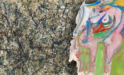
Willem de Kooning’s masterpiece, “Woman-Ochre” had a dramatic history. Crafted between 1954-1955, it was stolen in 1985—sliced from its frame at the Arizona Museum of Art. No trace of it was left for thirty-two years, until it popped up at a New Mexico estate sale in 2017.
De Kooning, a Dutch immigrant to the U.S. in 1926, was a unique voice in art. This painting’s dynamic brushwork showcases this, and highlights his attention to detail.
There was hot debate around this artwork. Some suggested it snubbed abstract expressionism due to its figure. Yet, de Kooning insisted, “even abstract forms needed a likeness”. Feminists were critical too, detecting violence towards the depicted woman. Despite these debates, “Woman-Ochre” is a powerful piece, packed with de Kooning’s signature style and daring choices. Its compelling background and artist’s distinctive craft puts it as a high-authority work in art history.

“Bed” by Robert Rauschenberg, created in 1955, is an iconic work of art that blends painting and sculpture in a way not seen before. Known as a “combine”, this hybrid art form throws out the rule book. Rauschenberg has taken ordinary items, in this case his own bed linens, and elevated them to art. The story goes that he ran out of canvas one day, so he turned to his sheets, pillow, and quilt as his new medium. Doodles and drips of paint transform the bedding, until it looks like an abstract work by Pollock or de Kooning. But where their brushstrokes expressed their inner emotions, Rauschenberg’s marks point outward to the world around him.
He mounted his linens on a wooden frame just like a painting, even arranging the pillow and quilt so the ‘bed’ looks neatly made, minus one untucked corner. It’s a nod to the everyday, but presented in a revolutionary way. “Bed” is as much a portrait of Rauschenberg’s life as it is a breaking down of artistic barriers. It’s filled with his personal objects, signifying his shift from tradition and making a powerful statement about finding beauty in the ordinary. This piece set the tone for the Neo-Dada movement and blew open the doors for future artists to experiment. Rauschenberg’s provocative style showed that anything, even a bed, could be a tool for creating art.

In the post-World War II art scene, Clyfford Still emerged as a crucial player. Shifting from realistic to abstract painting, he was a step ahead of others—a pioneer in the Abstract Expressionist movement.
His approach was unique—one developed in San Francisco while instructing at the California School of Fine Arts. This is most evident in “1957-D-No. 1”. The painting is a stunning patchwork of vibrant yellow and beige bolt shapes against an abyss-like black. It feels like a tug-of-war—colors pushing forward on the black canvas, creating a bold visual tension.
“1957-D-No. 1” was one of two Still paintings added to the Buffalo AKG Art Museum collection in the late 1950s—a confirmation of Still’s influential role in shaping Abstract Expressionism.

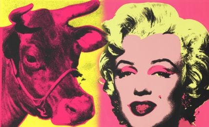
In 1962, Andy Warhol transformed the ordinary into the extraordinary with his iconic work, “Campbell’s Soup Cans”. Each of the thirty-two canvases brought to life a different flavor of the soup, a homage to Warhol’s habitual lunch, as he admitted, “I used to have the same lunch every day…the same thing over and over again.”
Warhol used a blend of techniques—projection, tracing, painting, and stamping—to recreate the brand’s packaging, over and over again. This repetition shook the traditional concept of art. Each similar image both magnified the product’s ubiquity and toyed with the idea of originality in painting.
When Irving Blum first displayed these soup cans in July 1962, it was in a simple row much like a supermarket shelf. The unique exhibit puzzled audiences and it failed to create a big stir at its launch.
Over the years, though, this artwork has gained reverence as a critical turning point in pop art history. It was the way Warhol captured the ordinary, making visitors look anew at a familiar sight. A simple can of soup was, in Warhol’s hands, a mirror to American consumer culture.

“Masterpiece” —a fitting title for this 1962 painting by pop artist Roy Lichtenstein. Known for comic book-inspired works, he took a unique approach here. This piece, part of his pop art phase, merges commercial printing techniques with cartoon imagery.
The original image for “Masterpiece” was pulled from a comic book. It starred two similarly positioned subjects, only they were in a car. Lichtenstein’s twist on the imagery, combined with the painting title, is seen as a playful jab at his own career. Time revealed his self-deprecating humor as not only clever, but also an uncanny prediction of his future struggles.
“Masterpiece” showcases Lichtenstein’s signature Ben-Day dots, a print-style technique named after illustrator Benjamin Day. The painting also includes speech bubble content, a typical comic strip feature. In 2017, this iconic piece fetched a whopping price of $165 million. As a testament to his impact, the Roy Lichtenstein Forever Stamps were issued in 2023.

Agnes Martin, a Canadian born revered American abstract painter, created the iconic piece “Friendship” in 1963. This gold leaf and gesso work uses a square canvas—something that came to define Martin — stamped with her signature grid pattern. However, unlike most of her minimalist pieces, “Friendship” oozes a rare opulence thanks to its glowing gold leaf.
Martin’s work reflects her spiritual beliefs. Zen Buddhist ideas and American Transcendentalism come together to create abstract geometric language. Her artwork is a journey akin to crossing an empty beach to gaze at the sea.
“Friendship” sets itself apart from Abstract Expressionism and Minimalism, acting as a serene meditative space. Gold, a symbol of illumination and compassion, reflects the painting’s title, further showcasing Martin’s unique contributions to abstract art. This piece, like her entire body of work, is a profound exploration of tranquility.

Edward Ruscha, a native Oklahoman, spread his artistic wings in Los Angeles at the Chouinard Art Institute. The Pop Art movement of the 1960s embraced his snapshots of everyday life.
Ruscha found beauty in apartment blocks and gas stations. He first explored this theme in his debut artist’s book entitled Twentysix Gasoline Stations—a photographic collection that captures stops on Route 66, from LA to Oklahoma City.
In 1963 one of the images inspired his striking masterpiece: “Standard Station, Amarillo, Texas”. In “Standard Station”, he catapulted a simple locale into a rich symbol of the American everyday landscape.
Initially using the screens from his print, Ruscha mixed colors and compositions for three unique versions. Screenprinting allowed smooth, solid color and seamless color blending. This was thanks to a trailblazing technique called “split fountain”.

“Harran II” hails from the skillful brush of Frank Stella, an impactful participant in the American post-war art scene who helped transition painting from Abstract Expressionism to Minimalism. Part of a series inspired by a semicircular drafting tool, the work dances with bright, concentric circles—a nod to Stella’s protractor theme. Drawing on the history of Asia Minor for its title, the piece shows Stella’s love for blending the old and the new.
The painting itself is a study in contrast: two vertical protractors, each locking horns with a horizontal one. Inside each structure, eight rainbow rings breathe life into the canvas. But don’t be fooled by the appearance of round curves—every shape is born from intersecting straight lines. The effect? A vibrant mashup of rigid grid and flowing arcs that make Stella’s work distinct. The combination is dazzling and daring, challenging the boundaries of both abstract and pattern painting. A far cry from the black-and-white art he began with, “Harran II” boldly showcases Stella’s transformation as an artist.

“Red Petals”, a powerful piece by Sam Gilliam, showcases his skilled action painting. Gilliam is known for his abstract, color-driven works. He got his start with the Washington Color School. This pioneering group of artists took abstract art in new directions in the mid-20th century. Gilliam’s art also echoes abstract expressionism and lyrical abstraction.
The 1960s were transformative for America. For Gilliam, it ignited a creative flame, allowing him to reflect the African-American experience through abstract art. This was ground-breaking because many argued abstract art didn’t mesh with Black experiences.
For “Red Petals”, Gilliam took a bold approach. He dripped paint onto a raw, unstretched canvas. He then folded it and hung it up to dry. The next morning, he experimented with a variety of techniques: dabbing, splattering, folding, rolling. He let control and chance work in tandem, setting the stage for a controlled chaos. He reveled in this mix of intention and randomness. This tension is the secret sauce that gives “Red Petals” its distinct kinetic energy and emotional depth.

The 1982 painting ‘Untitled’ is a masterpiece by Jean-Michel Basquiat. The piece is unrefined yet extraordinarily powerful. It propelled the young artist into well-deserved fame, forever altering the art world with its pure magnetism. Virtual glimpses into Basquiat’s intense graphic forms suggest an admiration for Cy Twombly’s work. The art channels a primal expression, caught in the domain of formal symbolism.
The enthusiasm surrounding the painting soared in May 2017 when it entered the auction house of Sotheby’s. The piece caught the attention of Yusaku Maezawa, a Japanese businessman and art collector, who acquired it for an astounding $110.5 million, shattering the estimated price of $60 million.

“Untitled, 2005” is one of the last masterpieces by Cy Twombly. It’s a huge painting, full of energy and force. To create it, Twombly used a long pole with a large brush soaked in rich, deep-red paint. It recalls the approach of Henri Matisse when he painted his chapel in Vence. With this tool, Twombly paints a climbing, falling web of red over a warm, flesh-colored backdrop. It’s like watching blood or wine rise and fall, pour and drip. The outcome is an intense, powerful mass. It’s a force that fills the viewer with a sense of primitive rhythm and grandeur.
This work is part of Twombly’s Bacchus series, regarded as the peak of his career. It epitomizes his five decades of painting. He took his signature spiraling loop, seen in his “blackboard” paintings from the 1960s, and made it wilder, more visceral. He reintroduces his ongoing theme of intense, swirling dynamism. The painting courses with the energy of Bacchus, the Greek god of wine, showcasing the deep connection between ecstasy and madness. It tells an epic story, where wine is like blood, rising and falling in a passionate dance. It reminds us of life’s own volatile, intoxicating motion.
Demonstrating the popular appeal of Twombly’s work, “Untitled, 2005” sold for an astounding $46,437,500 at a Christie’s auction in 2017.